Ascii UI -> pixels UI continued
Dungeon Mercenary » Devlog
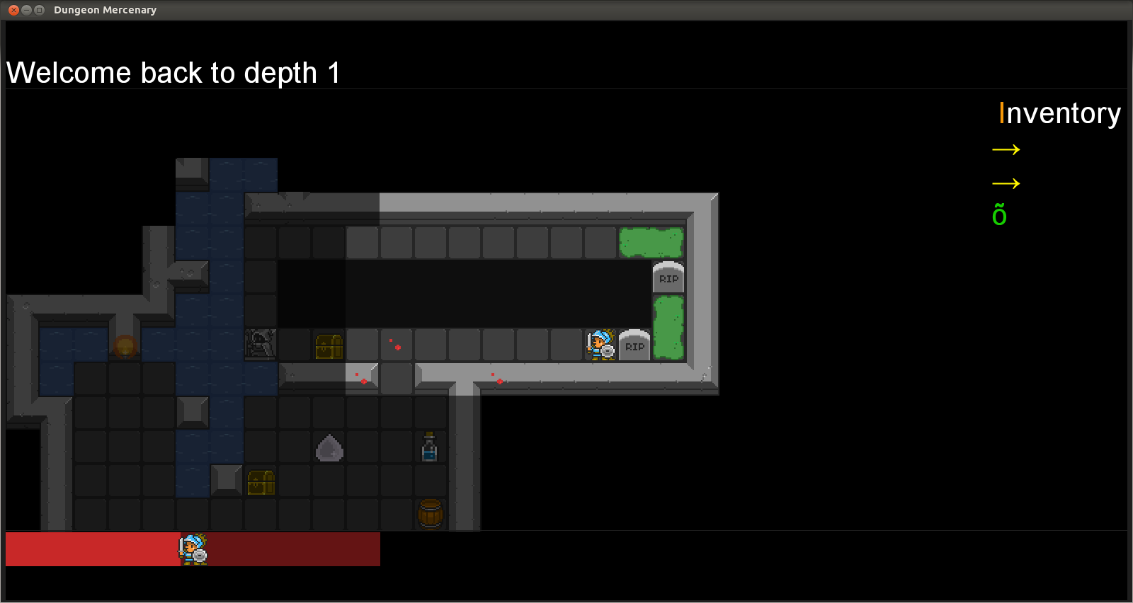
I'm continuing to port my ASCII UI to pixelart. I've changed the inventory. Here's how it was:

and how it is now (inventory border looks a bit glitchy on the screenshot, but it isn't):

This change will also leave space in the UI to move the "health bars" panel (see previous devlog) to the right, and make it vertical. I think it makes more sense to have the bars vertical, since width is not much required. Please voice your opinion, it's very much appreciated!
Get Dungeon Mercenary
Download NowName your own price
Dungeon Mercenary
Modern ASCII roguelike - Can your mercenary beat the dungeon ?
| Status | Released |
| Author | smelc3 |
| Genre | Role Playing |
| Tags | ascii-art, Difficult, Dungeon Crawler, Fantasy, Perma Death, Procedural Generation, Roguelike, Singleplayer, Strategy RPG, Text based |
| Languages | German, English |
| Accessibility | Subtitles |
More posts
- My new game has its own page now: https://hgames.itch.io/pixel-card-warsAug 31, 2020
- Completing the boardJul 23, 2020
- Got board drawing workingApr 30, 2020
- Back to indie dev...Feb 06, 2020
- 2018 recapJan 01, 2019
- Released first demo of my second roguelike game: Rogue vs Evil -> https://hgames...Nov 24, 2018
- Coded a new pixelart procedural room: wizard officeNov 15, 2018
- Added trapsNov 09, 2018
- Adding skillsOct 31, 2018
- Enhanced monsters' descriptionsOct 25, 2018
Leave a comment
Log in with itch.io to leave a comment.